Friday, February 8, 2013

Rainy Skies, Bright Smiles

This is one of my favourite layouts. Not only am I happy with how it turned out design wise, but it is such a happy occassion for me. 
 This photo was taken on a weekend away with My Boy. We went to Lorne for the weekend and he proposed! This photo was from the next day and it was raining and we were walking along the beach and even though it was bad weather we were o so happy :) That's where the idea for the title 'Rainy skies, bright smiles'
 And here are some detail shots of the pretty embellishments! Love these layered doily stickers and the fabric tape stickers are pretty cool too.
Happy Scrapping!

Thursday, February 7, 2013

My Bffs


Another day, another scrapbook page. This one is not my usual colour scheme, orange is NOT my colour. But the water colour paper was so fabulous I just had to use it. 
I like this colour scheme for indoor/older photos because they have an orange-y tinge to them and using orange around the photo makes them seem less orange in comparison. It was fun to use some painting borders and ink splatters. They blend well with these papers and embellishments
This has to be my favourite washi tape!
Happy Scrapping

Wednesday, February 6, 2013

Don't Wanna Miss a Thing

So I've been a bad blogger and haven't posted in too long. I guess I haven't been feeling very inspired lately so haven't had alot to share. But I'm going to try and start sharing more often. We'll start with a string of posts showing what I made with the Amy Tangerine Sketchbook collection. I know it has been out a while but I haven't shared yet and still love them so why not?
An old photo album, from when I was 15 - 17 years old has fallen apart so I have started scrapping photos from those years. I am using quite a few page protectors because I would never get it all done on 12x12 pages. But I wanted to include some regular pages for the bigger stories. The first section are all photos from my 15th birthday party which doesn't require too much journalling. However, this page needed to be made because it was an awesome story, so needed a bit of extra attention. My two friends took me to the bathroom for a special performance of 'I don't wanna miss a thing' by Aerosmith. It was a big song at the time and it made me laugh so much.
I had so much fun playing with all of the Amy Tangerine Sketchbook line. It was the first time I went all out and bought a heap of embellishments for one collection. For some reason I just really loved it and NEEDED it all! Ha ha.

Wednesday, November 7, 2012

And then there were cards...

And now for some cards. The other day I blogged about my recent purchases so today I thought I had better show you one of the cards I made with them. I love these Dear Lizzy papers. So much so that I even went out and bought some more!
I'm not overly happy with the saturation of this photo but I guess the more I try the better I'll get at this! I do like the detail shot below though...
That's about it for now! Happy Crafting
Sarah
 
You can't use up creativity, the more you use, the more you have - Maya Angelou

Thursday, November 1, 2012

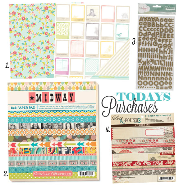
Todays Purchases - Episode #05

Some of the purchases I made the other day at Chandon Craft, my favourite local scrapbooking store!
1. Dear Lizzy 5th and Frolic papers. I wanted to get the paper pad because I'm into cards at the moment. They were sold out so I bought a few of the papers I loved and cut them down to 6x6 and 6x4 sections as soon as I got home. Then I bundled them together in a bulldog clip and ta-da! My very own paper pad. Plus no fear of ruining a big 12x12 pad by cutting it up because it's already done
2. Midway paper pad by October Afternoon - so fun!! How could I go past this for birthday cards?
3. Dear Lizzy Thickers - love the gold! So sparkly, and it's the same font as Playschool. I felt very nostalgic when I remembered that
4. Lost and Found 3 Ruby paper pad. I have been attempting to make some wedding/engagement cards lately and I thought this colour pallate would be great for them.

Happy Scrapping
Sarah

Every artist was once and amateur - Waldo Emerson

Thursday, October 18, 2012

Challenge #228 - Sketch

This was my attempt at this week's sketch at 365cards. I tore the sandy coloured paper to make it look more like sand and thought some surf boards would look cool sticking out from between the layers.
I covered the surfboards using dimensional magic which makes them look more realistic and adds some extra texture to the card.
I drew the clouds by hand using white gel pen.
Sarah

You have to go whole heartedly into anything in order to achieve anything worth having - Frank Lloyd Wright

Monday, October 15, 2012

3 Favourites

A fun card with three of my favourites. The challenge at 365 is to use your favourite colour, favourite patterned paper and favourite tool. I used the butterfly punch and went for polka dots.
The more I think about it Chevron is really my favourite pattern (if you couldn't tell) so I'd better have another go and use that as my entry.
Thanks for stopping by
Sarah

Stars can't shine without darkness - Anon

Sunday, October 14, 2012

Challenge #226 - Colour Scheme

Here is my attempt at the colour challenge. It wasn't the colours that sparked this card in the end, it was the tree sticker. I was cleaning my desk and flipped through a sticker book I had from Amy Tangerine and found this cool sticker with a heart on a tree. I thought it would be really cute with two wood veeneer people underneath.
 The colour I added next was the green - this seemed obvious to me as leaves are green. Then I already had 3 of the 4 colours needed for the colour challenge so I just flipped through my stash and pulled some other brown papers. I liked this brown damask because it fits with the theme of engagement/weddings in a subtle way.
So it appears that the portrait function on my camera works better if it's in auto mode rather than portrait... oh well
Sarah

The question isn't who is going to let me; it's who is going to stop me - Ayn Rand

Challenge #227 - ATC

I haven't made an ATC card before but when the challenge came up today on 365cards I thought I would give it a go. The theme was 'School' so I searched through some older paper pads and found one from Kasier that had some cool die cuts and foil papers in it.
Here is my ATC (Artist Trading Card I believe it's called) It was a fun little experiment and made my card come together really quickly.
I think I could make some of these to just add to cards when I get stuck. It would be a good way to start when I get stuck or if there is a particular embelishment I want to use.
Another detail shot that worked. I wish it was a bit more blurry in the background but I think I may have to have a better camera to actually achieve that. Will have to add a camera to my wish list
Sarah

Saturday, October 13, 2012

Challenge #223 - Double the fun

I bought this paper pad from Simple Stories a while ago. It has some really fun cut apart sheets with great sentiments that I can't wait to use. In this case the challenge was to double up on at least three items on your card, so I used a stamped sentiment for a second ink colour.
The doubled up items are: 
  • two gift embellishments (I made these myself)
  • two colours of bakers twine
  • two inks (I used black die ink for the sentiment and distress ink to highlight the patterned papers)
Here's a detail shot. I raised the presents using foam dots for a bit of emphasis and to make them seem like they were a bit more real. This was for challenge #223 at 365cards challenge blog. Been having fun with these challenge this week
Now I'm off to have a go at a colour challenge. Not my usual thing but a challenge is supposed to be a challenge, yes?
Sarah

Friday, October 12, 2012

Challenge #224 - Neon

Another 365cards challenge. I thought neon would be a bit of a challenge because I am deffinately not a fan of Neon colours (except for highlighting things.) I set to brainstorming some ideas and thought that it would be less in your face if I did a monochromatic card. Luckily, this flower was sitting on my desk so I had a jumping off point - and went from there. The colours look more neon in real life, but the pink flower centre is neon for sure.
Here's the embelishment in more detail. I am so glad I finally got a detailed shot to work how I had planned it! I have alot of trouble with detail shots, trying to get the camera to focus where I want it to can be a challenge, but occasionally it works out.
I also put some washi tape and border punches to good use and am happy with the result. I will deffinatley try this technique again when I have other big embelishments to use. In fact I have a cool wedding cake that I want to make a card out of and it might work well... I will have to take note and give it a go soon!
Sarah

Challenge #222 - Tick Tock

When the challenge was to include a reference to time I thought about clocks. But cakes are so much more fun, and I love to party party! So I used the theme as inspiration for my sentiment, "Party Time!"
This My Minds Eye paper pad is full of fun colours, I'm not a huge fan of orange but this pattern is cool so I thought I'd use it here. Check out the challenges at 365cards
Sarah

Challenge #225 - Tape It

Well this challenge was deffinately up my alley! I love washi, I was hesitant to buy it to begin with because I wasn't sure how much I would use it but I use it so much! To check out this challenge or others see the 365cards blog
This is one of my favourite techinques with washi tape. I cover a smaller piece with washi at an angle (Here I've used some patterned papers to vary the widths a little) then mount that piece onto the card using foam dots. I will often do a piece that is 1/2 an inch smaller than the card front so it covers almost all the front with a nice border.
If you haven't invested in washi tape yet I deffinatley reccomend it. And the best part is, if you make a mistake you can just pull it back off your project without any problems!
Sarah

Wednesday, October 10, 2012

Challenge #221 - Super Sketch

Super Sketch Sunday at 365cards involved a fun circle element. So I broke out this circle scallop border sticker and traced it to create the orange section. Then I jus added a sentiment sticker and some white gel pen stitches and hey presto!
I'm trialling some different ways to photograph my cards. This photo was taken outside on the steps with a white tshirt draped over them for a neutral background. I am still tweaking the effects in photoshop to get the colours right. This one is a bit saturated but I guess practice will make perfect. (I also need to iron the shirt I think!)
Sarah

Monday, October 8, 2012

Challenge #220 - Missed Oppurtunity

The challenge at 365cards was to try a challenge that you missed in the past. Well I loved this sketch from challenge #200 so I gave it a go. It was a good oppurtunity to make good use out of some of my border punches
Made it through another huge pile of card bases today - have been scoring more whilt watching tv tonight. It makes it so much easier if I have them all ready to go!
Sarah

Thursday, October 4, 2012

Challenge #217 - Long and Lean

The challenge today at 365 cards was to make a card that was 3x5 in dimension. I used what was on my desk to make this and it all came together pretty quickly.
I love instagram. It makes taking photos and sharing them so easy! It's not the same quality of other images but for uploading a quick snippet it is deffinately worth it.
Sarah

Tuesday, October 2, 2012

Primary Colours

Some cards I made using MME paper pad The Sunny Side. Love the primary colours, I was unsure about them at first, but once I started playing I realised these classic colours are super fun!
 How cute are these bikes and banners?
I mucked around with this second one for a while and it's something a bit different but I think I pulled it together in the end.
Happy crafting
Sarah

Sunday, September 23, 2012

Tiny Scraps

The perfect design for those tiny paper scraps! Punch little shapes out of the offcuts left from other cards. Hearts are so small that almost any scrap is big enough. It was a little fiddly to stick all the hearts onto the card front, but well worth it in the end!
Happy Crafting
Sarah

Monday, September 10, 2012

Love you just the way you are

Love this butterfly punch from Martha Stewart Crafts. A few pearls or rhinestones are the perfect addition to make them sparkle.
This sentiment is from a lable sticker sheet from My Minds Eye. So cute. I love a sentiment that is a bit different from the standard Happy Birthday or Thank You.
Happy Scrapping
Sarah

Wednesday, September 5, 2012

Challenge #188 - 21st Century

The challenge today over at the 365Cards blog was to be inspired by technology from the 21st Century. Well I thought about social media and mobile phones and was inspired to use text talk for my sentiment.
Here's my card - hope you like!
Sarah